


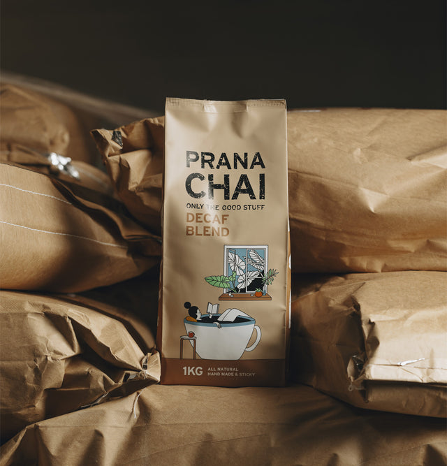


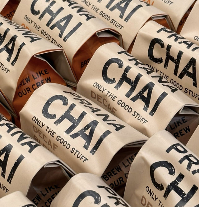

Re-Branding With Prana Chai

Prana Chai started over 11 years ago with three friends in the back of a small Melbourne coffee shop.
Now, over a decade later, Prana Chai has grown from the back of that coffee shop to more than 30 staff around the world and supplying thousands of the best cafes internationally.
Despite this growth, our goal remains the same, to help the cafes we supply bring more customers through their doors by offering the best tasting chai possible. As Vincent, one of our three founders says, “We try to provide a chai moment to help bring customers through the doors of our stockists to help them continue to do what they love so we can continue to do what we love".
Recently, we decided that although our goal hasn't changed, Prana has grown and morphed into what it is today and our branding could do with an update to reflect that.
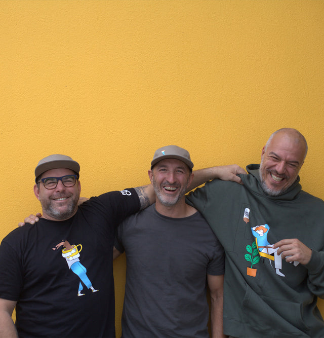
But with three founders comes three distinctly different view points, and each had different reasons for why they did, or in Koray’s case, initially did not want to re-brand.
In Mario's case, his point was “Personally, I felt that the original branding did not do enough to tell the story or express the brand and its intentions. The initial process in coming up with the original brand was not very complex, we wanted it to be in a natural looking bag and we wanted the text size variations to form an iconic image of sorts but we did not consider the product’s values and we did not try to speak to an audience through the design, probably because at that stage we had no audience!
Now that we have over a decade of trade and experience with our community we felt we could represent the product more accurately.”
However, Koray felt differently, “At first, i was cautious about the idea of changing the packaging. It felt unnecessary and I am not a big fan of the "stay relative" type of marketing. But after the redesign process (which included going back to people who consume and love Prana Chai) it kind of resonated with me. It is funny that I originally went for a version that had the most extreme deviation from the original design. The version that we ended up choosing was sort of a compromise and I didn't like it at first, although It sort of grows on me now. When I look at the brand now, I do not just see a new design but all the effort, ups and downs, our customers, and what they mean to us. That's why it feels like it was much needed.”

So although we had decided to rebrand, we still had to decide how, as Vincent says “I did not want to change the bag design so drastically to be honest, I was up for a a small change as we had done in the past. I thought that we had such an iconic bag that everyone knew about and that the change would be too much.”
Similarly, Mario said “The process that we went through to assess where we were and what we wanted to say with our branding was fun. It was a great time to reflect and we had a lot of robust debate about the nuances and specific details of each image and application, but when it came to making the final decision it was really hard to pull the trigger. The brand has done so well, we are all so proud of what it has done and I personally held fears that we were breaking the old adage of “if it ain’t broke don’t fix it”. I worried that the brand might not be recognised or that it wouldn’t fit with our customers.”
The next step was actually starting the creative process, from initial discussions, to market research and then final design choices.
Mario outlined our first steps, “the first thing we did was talk to our customers and ask them what Prana Chai meant to them and how it made them feel. That was nice because a lot of what came back resonated with what we aim to achieve and what Prana chai meant to us as staff of the company. After that we distilled those emotions and tried to express them through playful imagery”
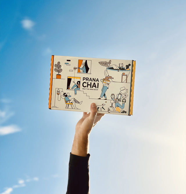
Koray said “This one is not complicated but took a lot of time: We asked our customers a bunch of marketing questions, they came back with answers, we picked the most common ones and applied this on the illustrations that we wanted to use on the bags. We sort of wanted to reflect our customers' most basic feelings on the packaging. The names of the illustrations are a true dedication to stay true to this strategy: Warm hugs, Prana is my life line, Prana for everyone, Doing the calm and Calm vs Crazy all represent a specific flavour and a common trait that our customers have”
Step four was creating specific goals for the re-brand, and each of our founders had different hopes for what a re-design would achieve.
Koray states “I would like this to be seen as a celebration of an Aussie brand that now reaches great cafes in all parts of the world, for only focusing on one product, for actively working on its practices, for being part of hospitality, for helping cafes offer a better product and customer experience to their own customers, but most importantly as a thank you from us to everyone who loves Prana Chai.”
